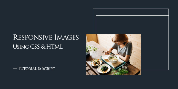
Responsive Image with CSS — Tutorial & Script
Simple strait forward easy way to make your web images responsive using CSS. A small but functional script is capable to do all the work for you.
This css code will make your image responsive without any distortion. Width & height will scale together proportionaly and stops once the image reaches its max size to avoid pixilization.
HTML
<body>
<img src=”images/im.jpg” width=”800″ height=”600″ />
</body>
CSS
img {
max-width:100%;
height:auto;
}
As you can see in the above css code, you should set max-width to 100% & height to “Auto”. Note that this script will make all images in your web page responsive. If you want to make to make a particular image responsive only, you should add a class or id to it then assign your css code to this class.
Download Demo